


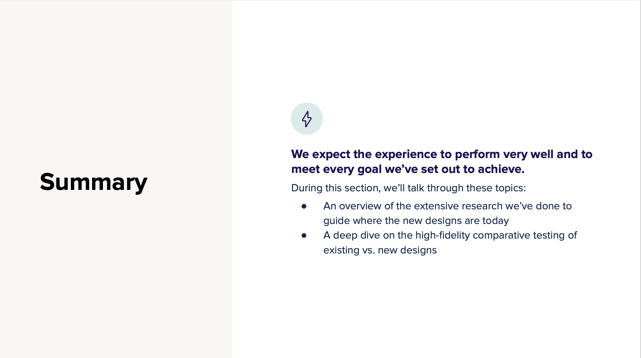


I led the end-to-end strategy and guided the execution of a comprehensive benefits experience rebuild to improve usability, scalability, and alignment with member expectations. As VP of Design, I oversaw a cross-functional team and ensured design decisions were grounded in rigorous research—including scenario mapping, usability testing, and comparative studies. By proving out key hypotheses through iterative testing, we delivered a dramatically more intuitive experience: 7 of 9 tasks saw significant gains in ease of use and task completion time. The new design not only streamlined access to critical benefits like ID cards and deductible balances but also created a scalable foundation for future enhancements, including the integration of point solutions.
To better serve members and meet payer goals, we led a comprehensive redesign of the benefits experience, reimagining everything from information architecture to usability. Through deep research, iterative testing, and real-world validation, we built a system that is easier to use, scales with complex partner ecosystems, and supports top member tasks with clarity and speed.
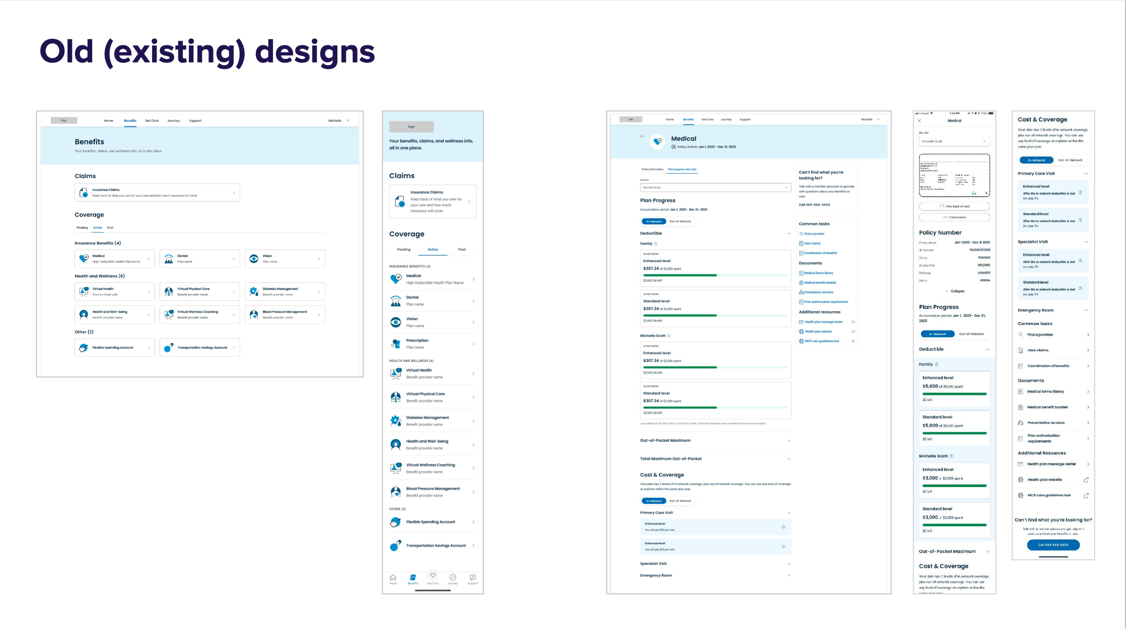
The original benefits experience caused frustration and inefficiency for members:
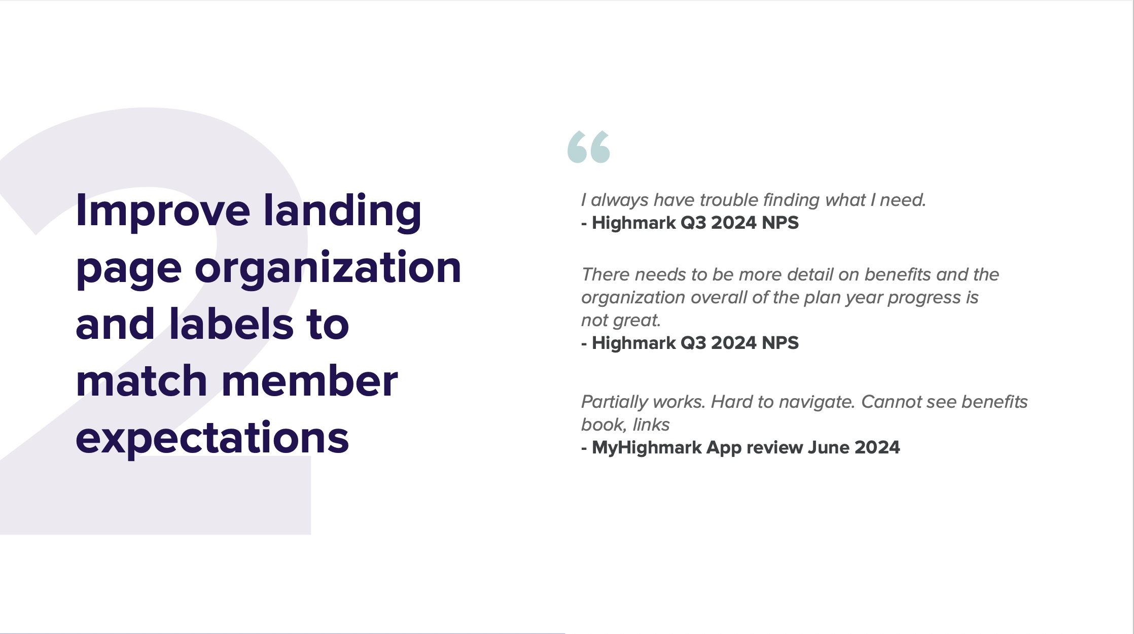
Poor organization and unclear labels made key tasks hard to complete.
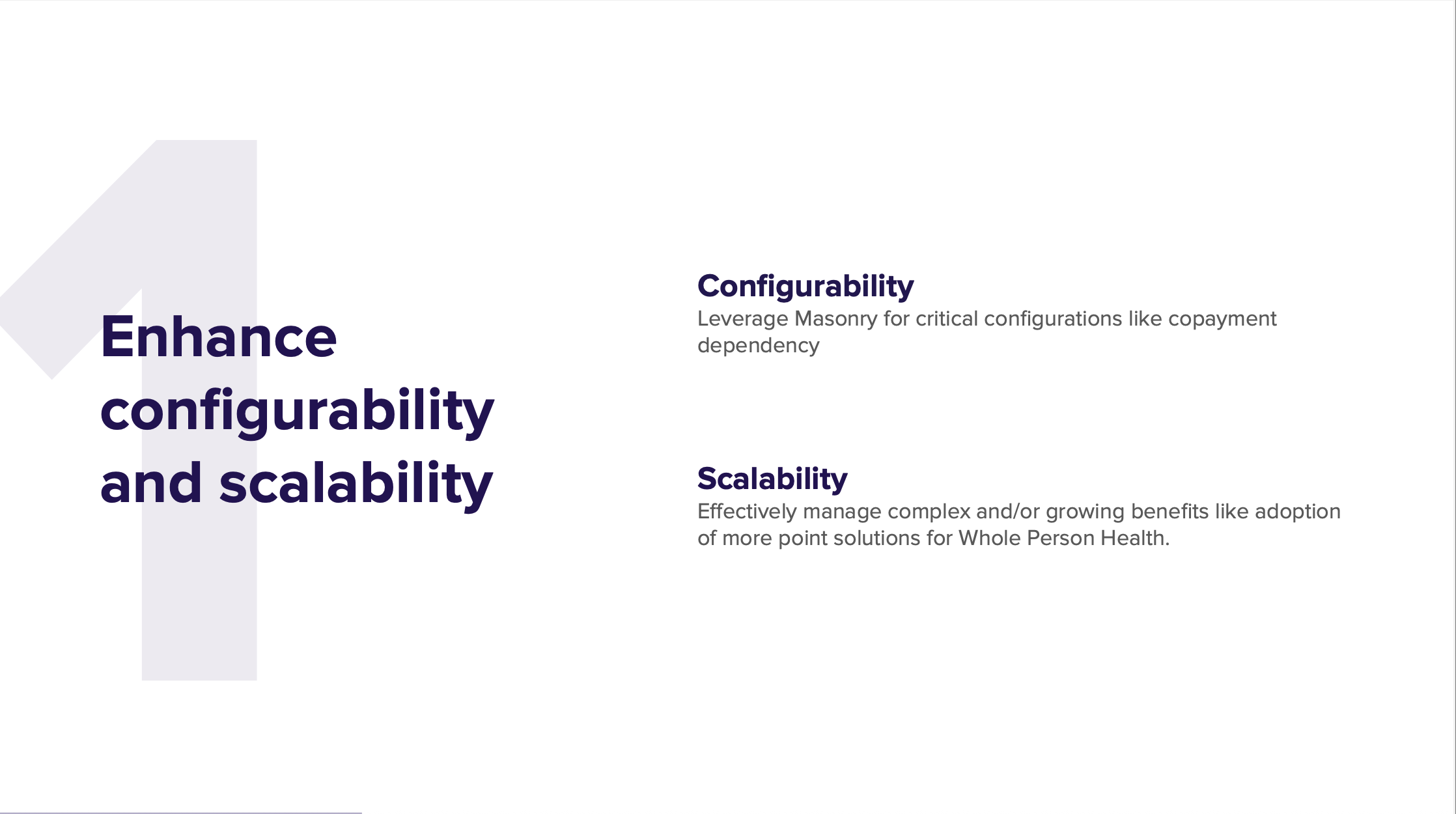
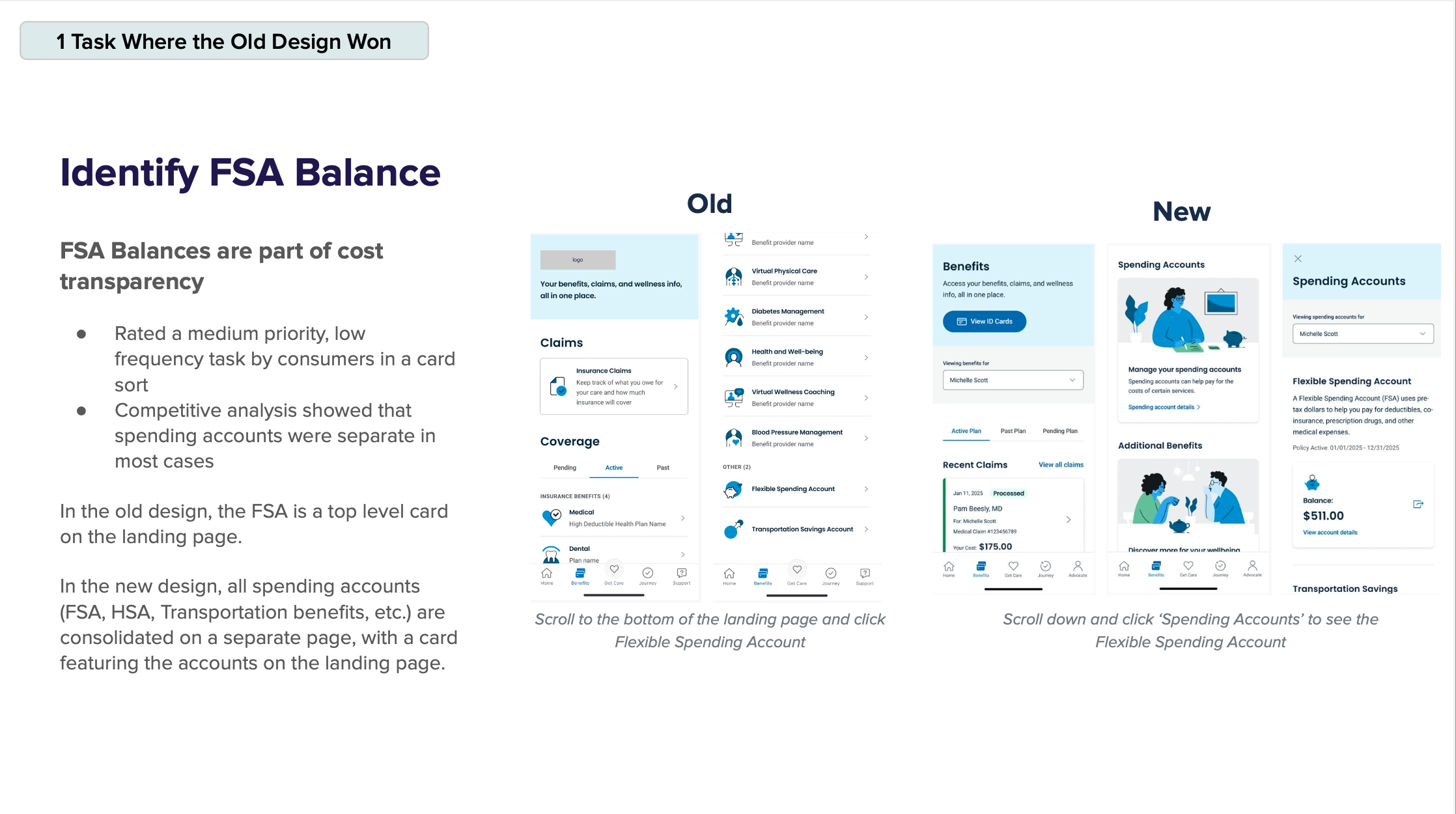
Lack of configurability limited the platform’s ability to support copayment logic and expanding partner solutions.
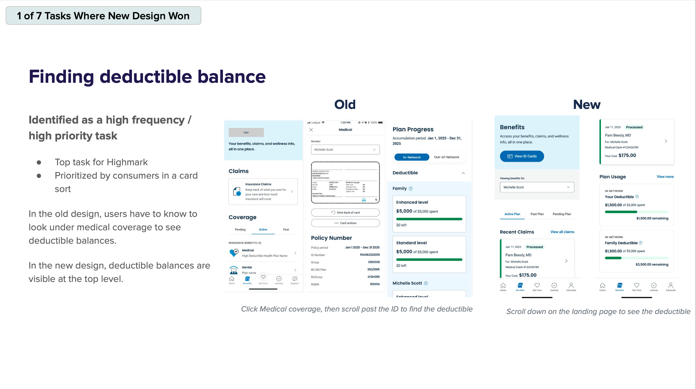
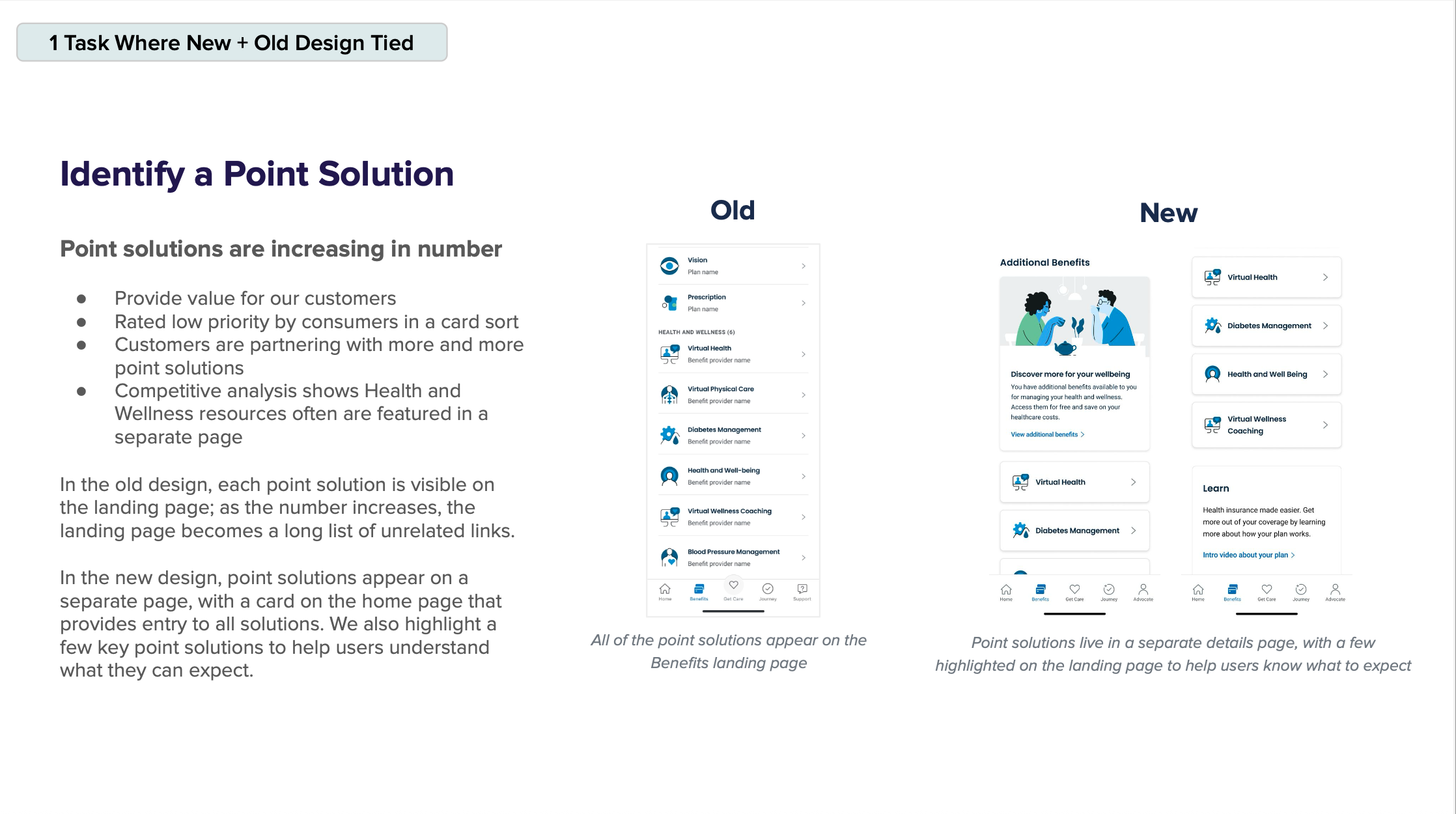
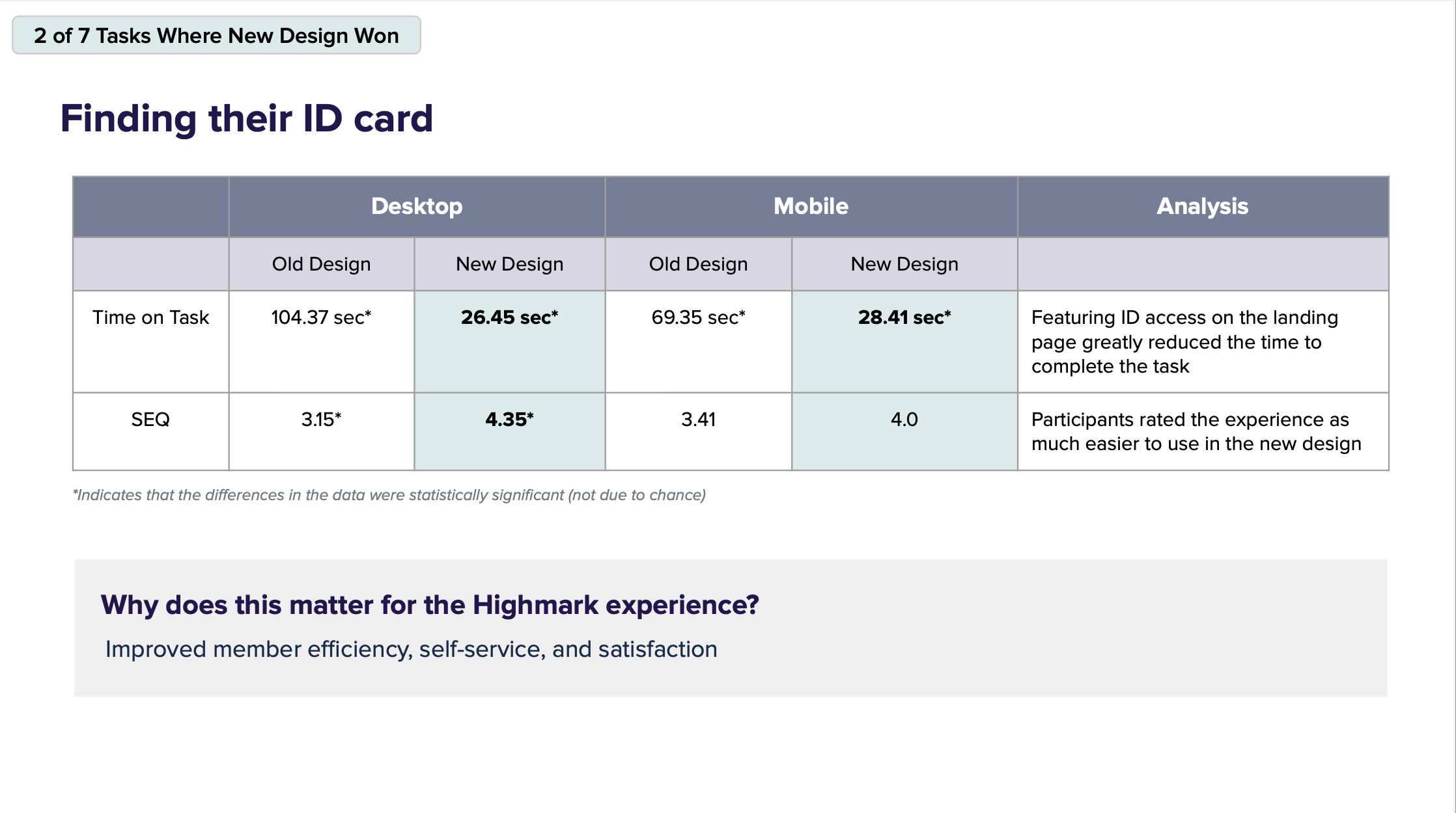
Critical tasks like finding ID cards or deductible info were buried in unintuitive paths, leading to high task failure rates and poor satisfaction scores.
"I always have trouble finding what I need." – Member feedback, Highmark Q3 2024
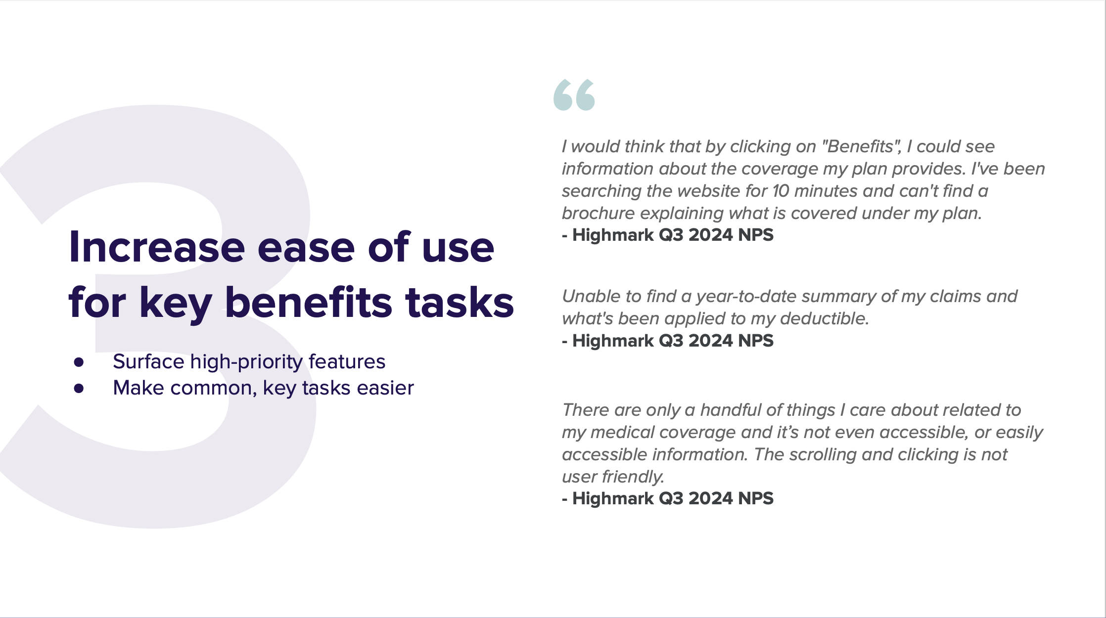
"There are only a handful of things I care about... and it’s not even easily accessible." – App Review
We redesigned the experience from the ground up with three guiding principles:
1. Improve Configurability & Scalability
Built the experience using Masonry (our SDUI framework) to allow backend-driven flexibility
Created modular components to support growing point solutions and future-proof needs
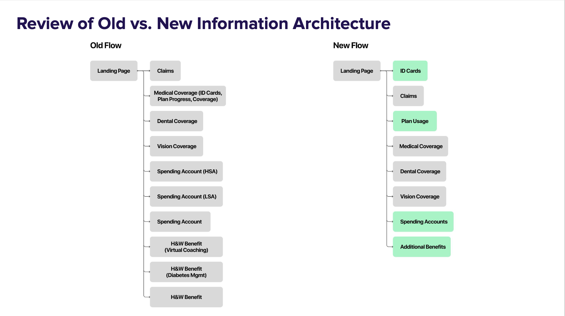
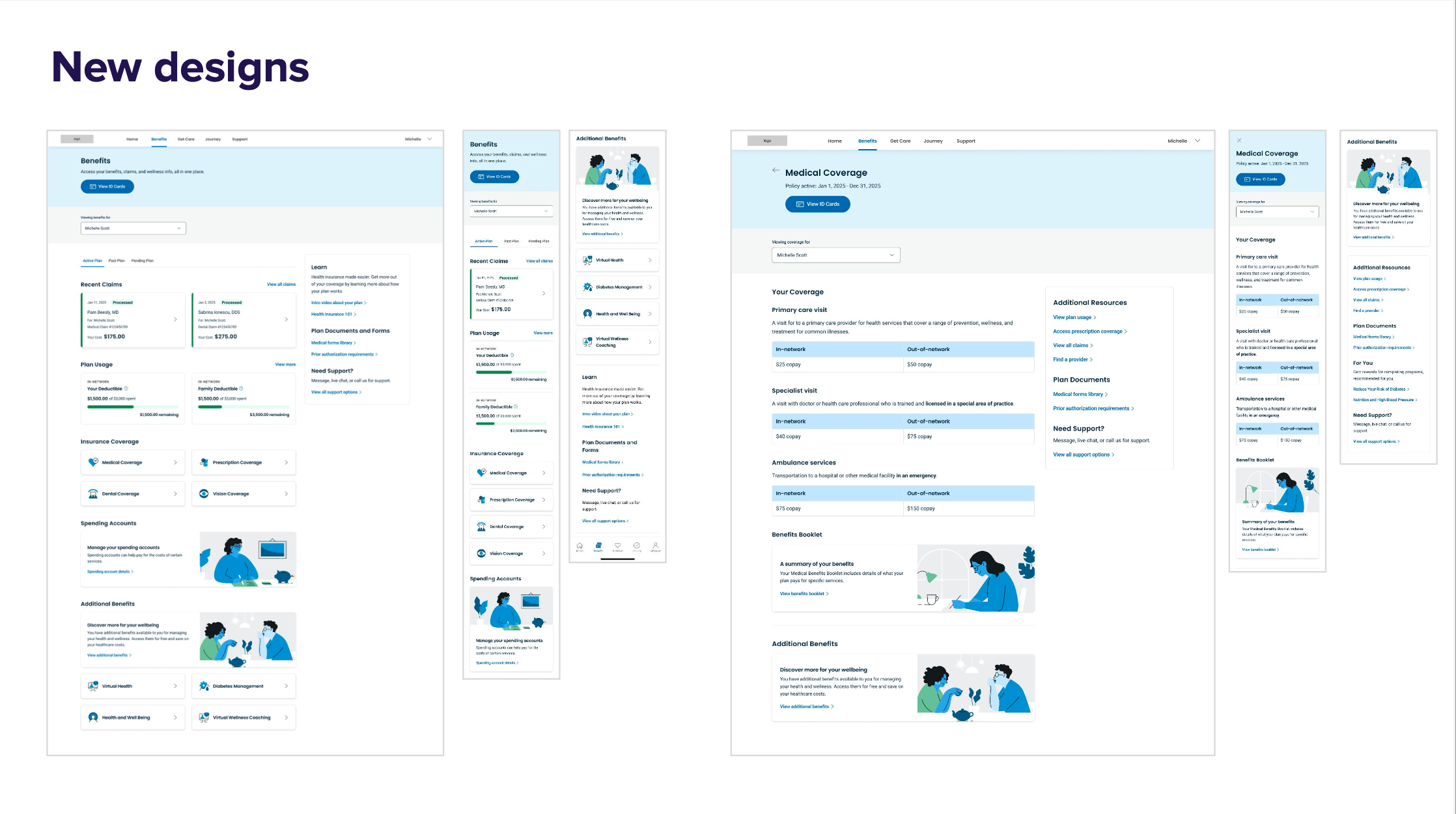
2. Redesign Navigation & Page Structure
Moved from a tangled IA to a clean, top-level layout with dedicated detail pages:
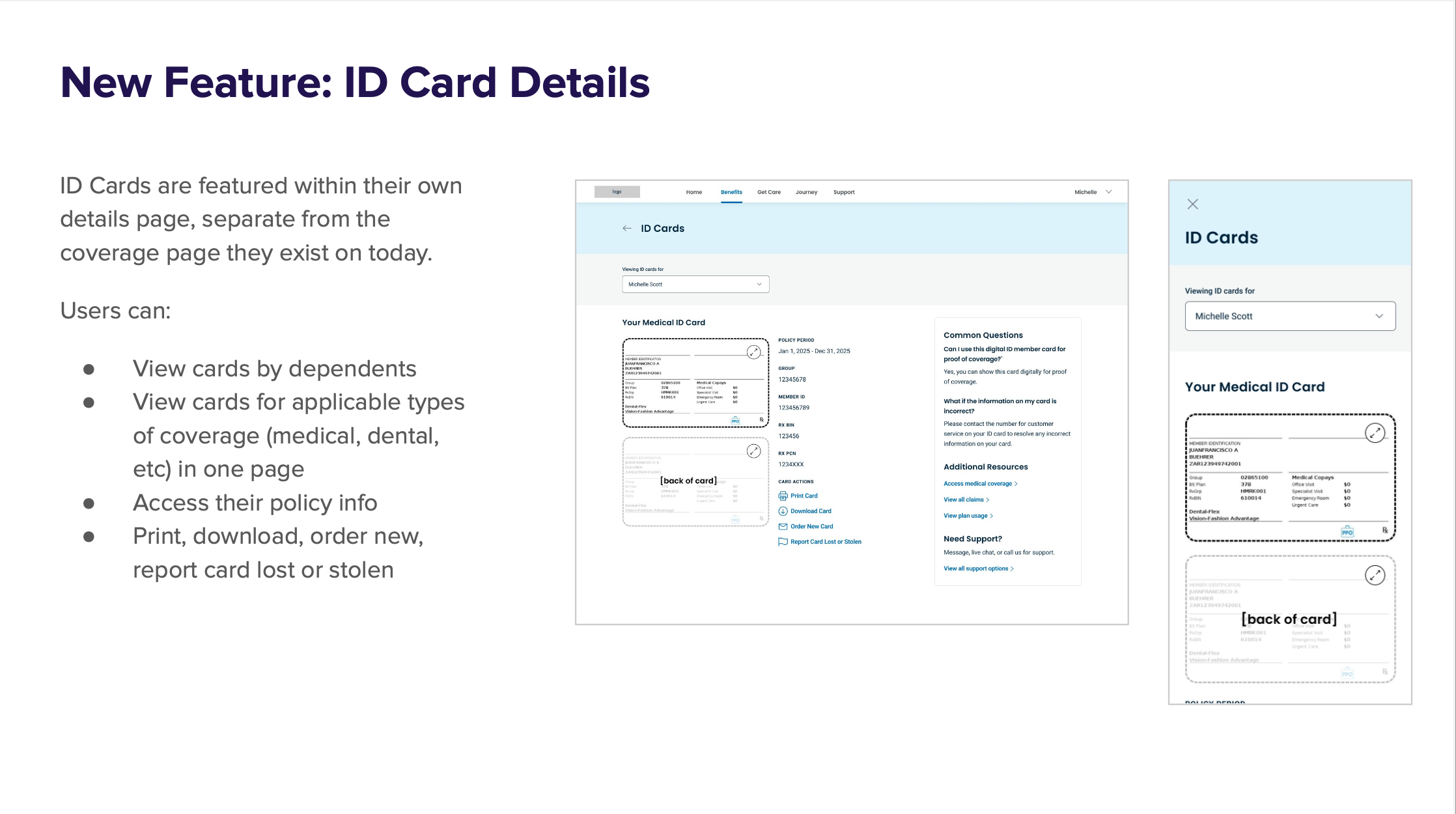
ID Card Page – centralized, accessible by dependent or coverage type
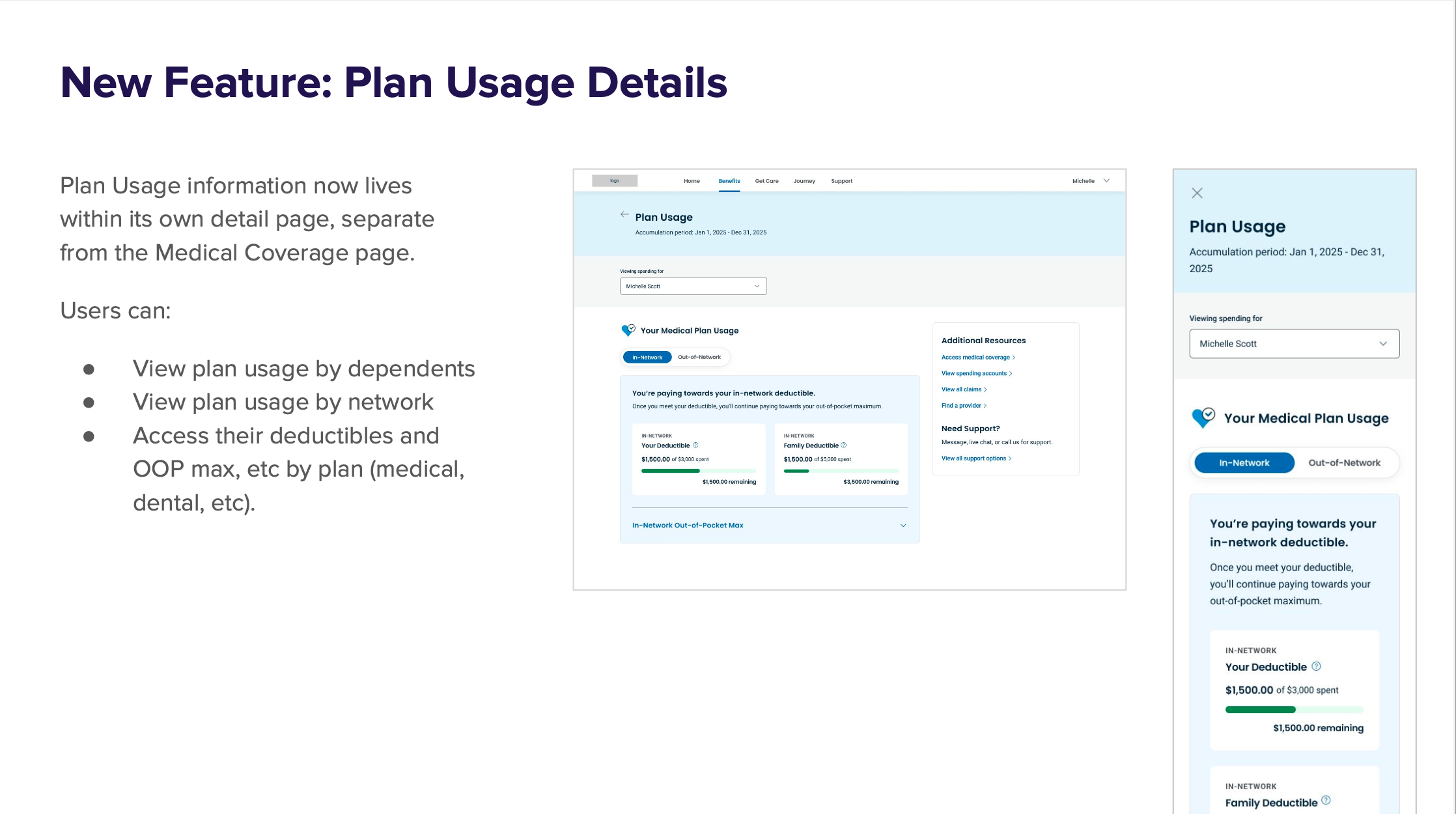
Plan Usage Page – easy access to deductible, OOP max, etc.
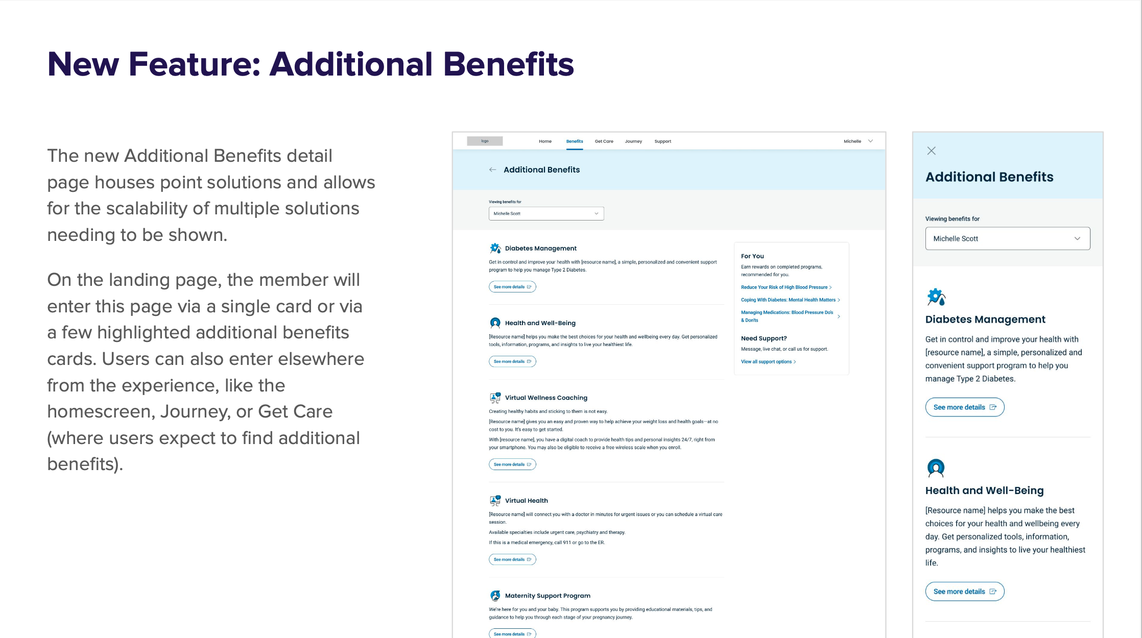
Additional Benefits Page – scalable point solution support
3. Surface High-Priority Tasks
Reorganized top-level pages to place high-traffic, high-value tasks up front
Used research-driven labeling and grouping to reflect member expectations
As VP of Design, I:
Led the end-to-end strategy and execution of the benefits redesign
Guided the team in defining user journeys, building and validating prototypes
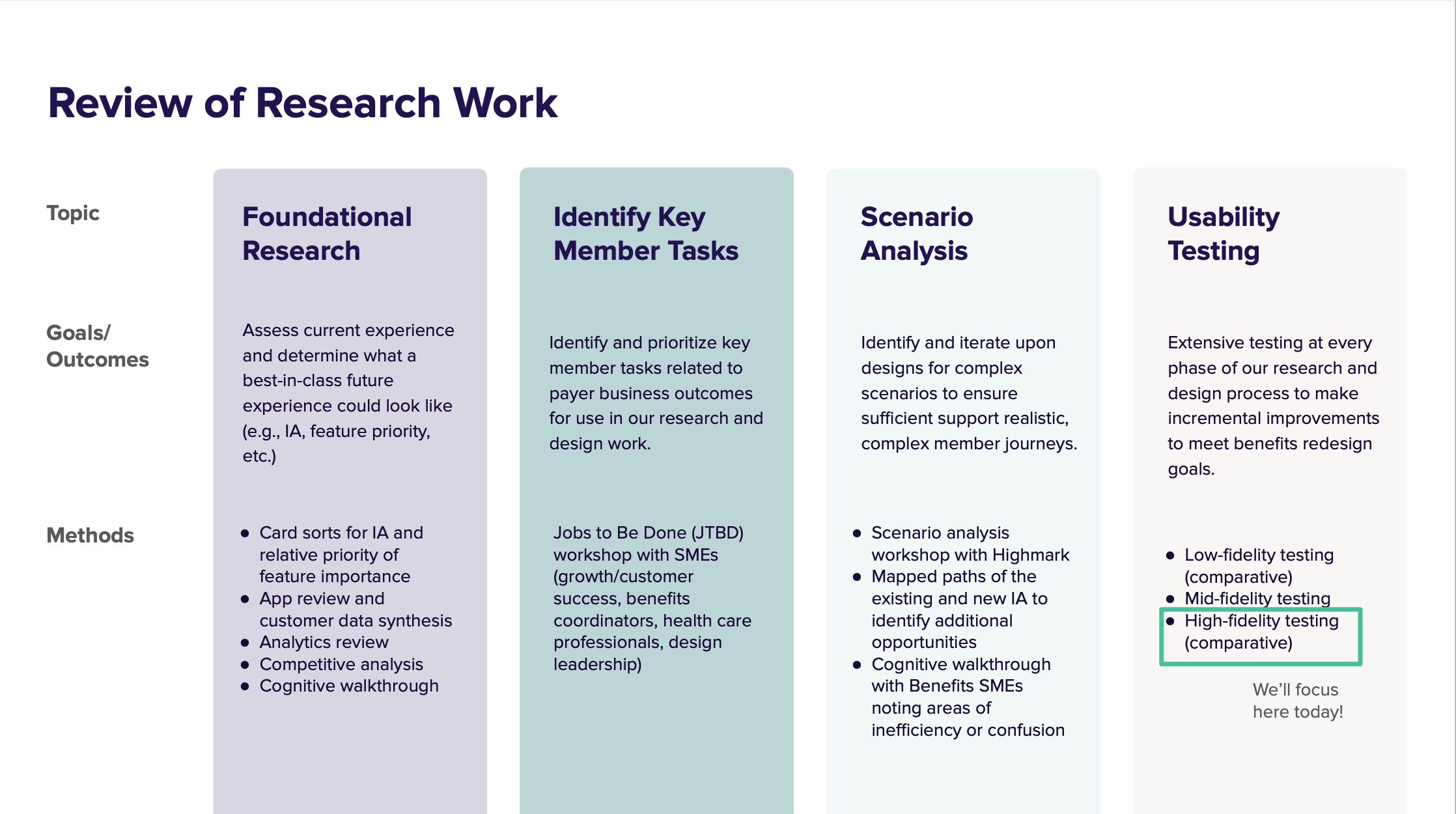
Ensured we applied scenario analysis, JTBD workshops, and multi-fidelity testing to ground the work in evidence
Oversaw cross-functional collaboration with Highmark stakeholders, SMEs, and research teams
Championed a flexible system design that could scale across diverse payer configurations
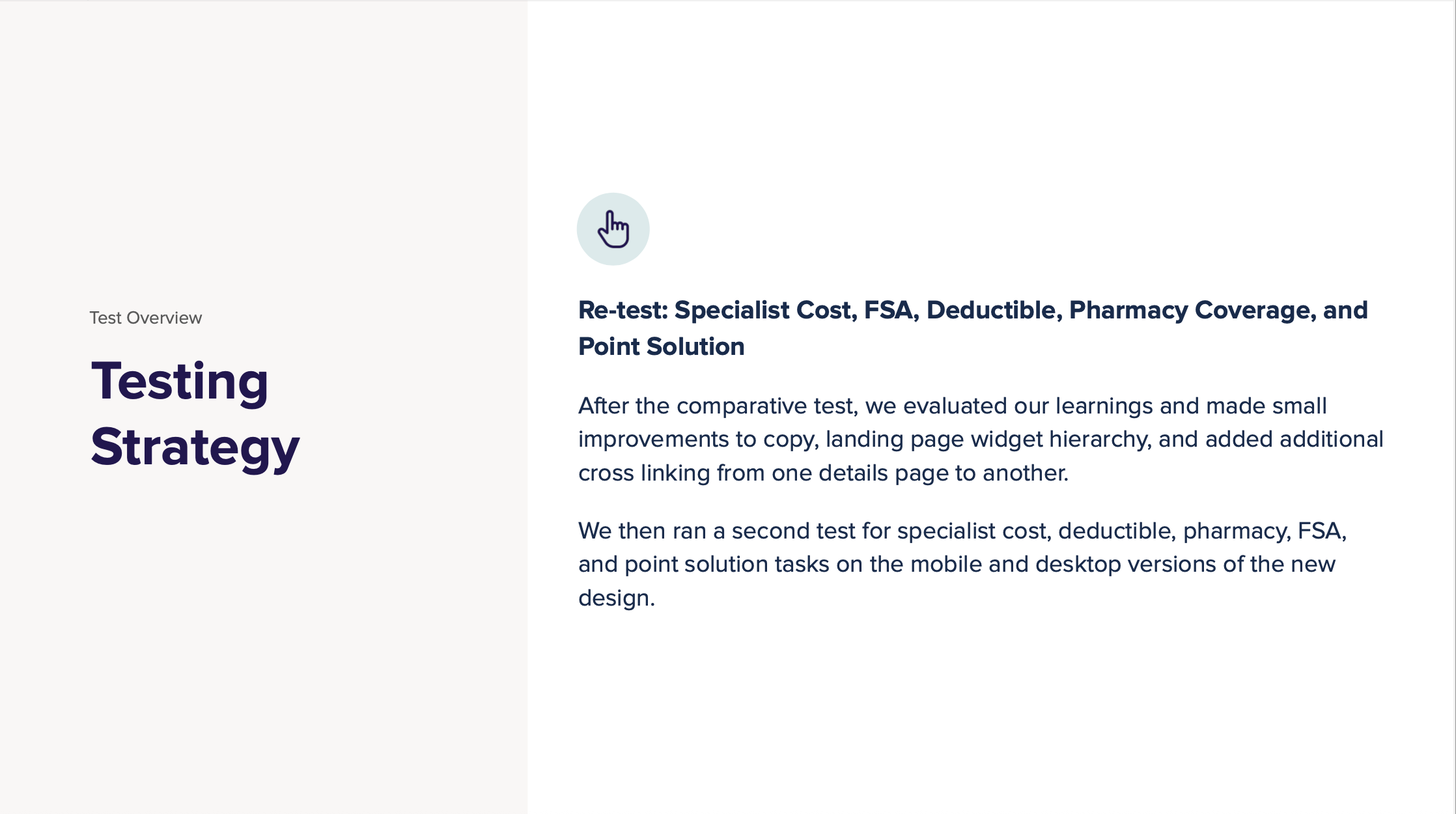
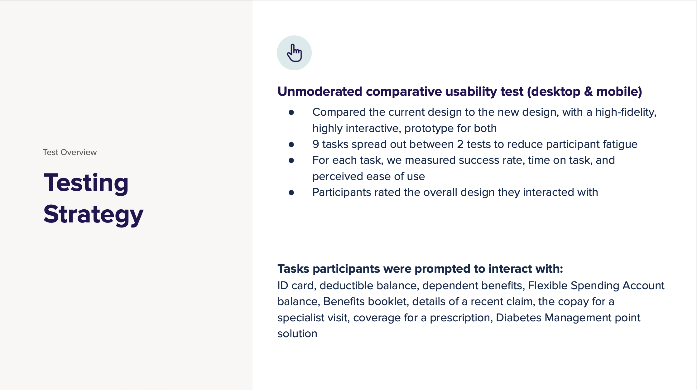
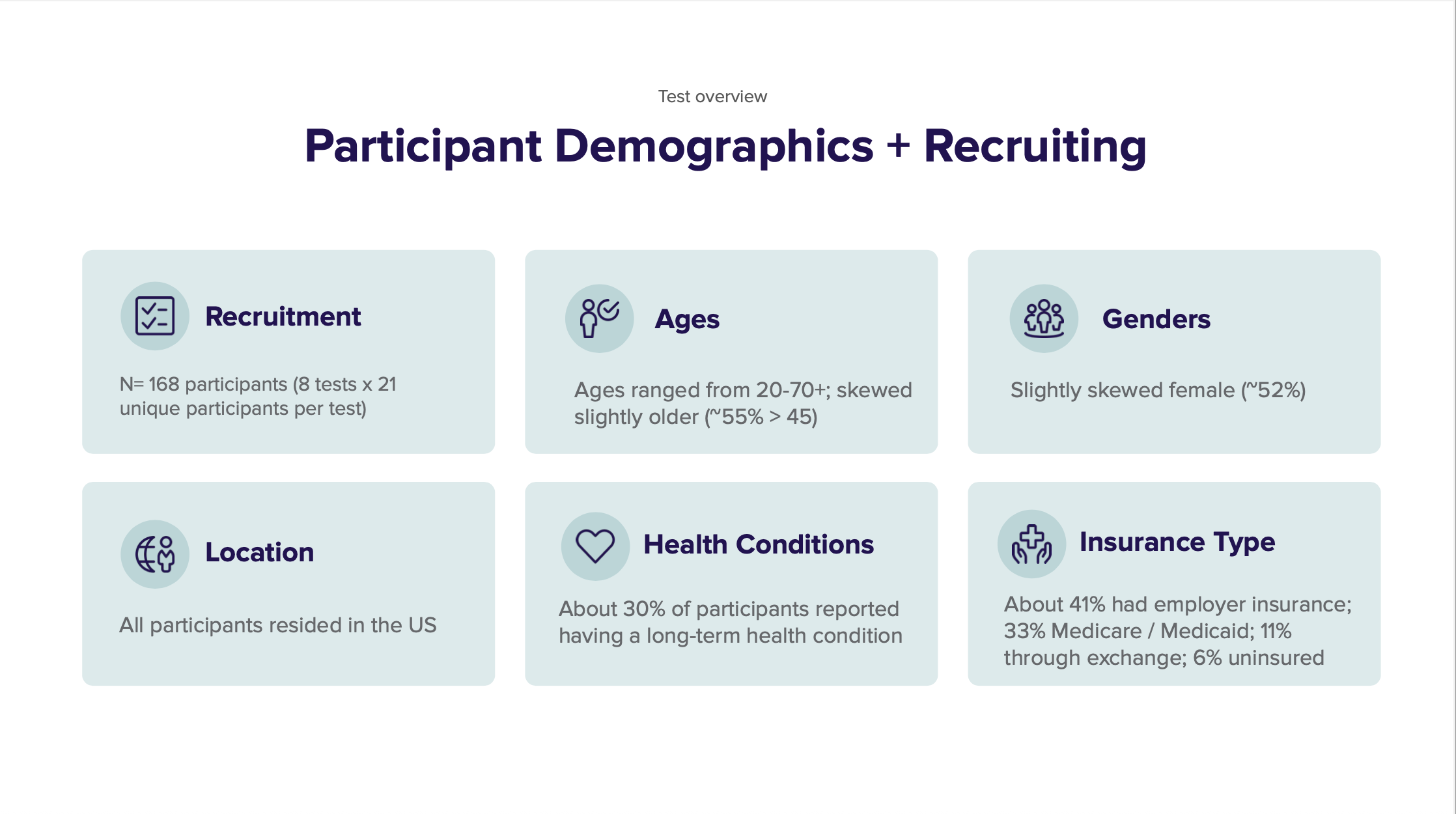
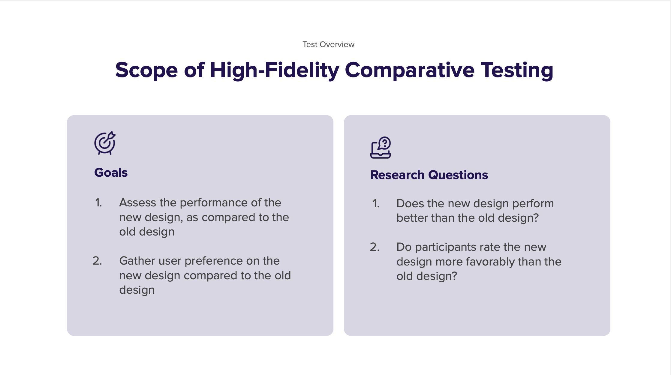
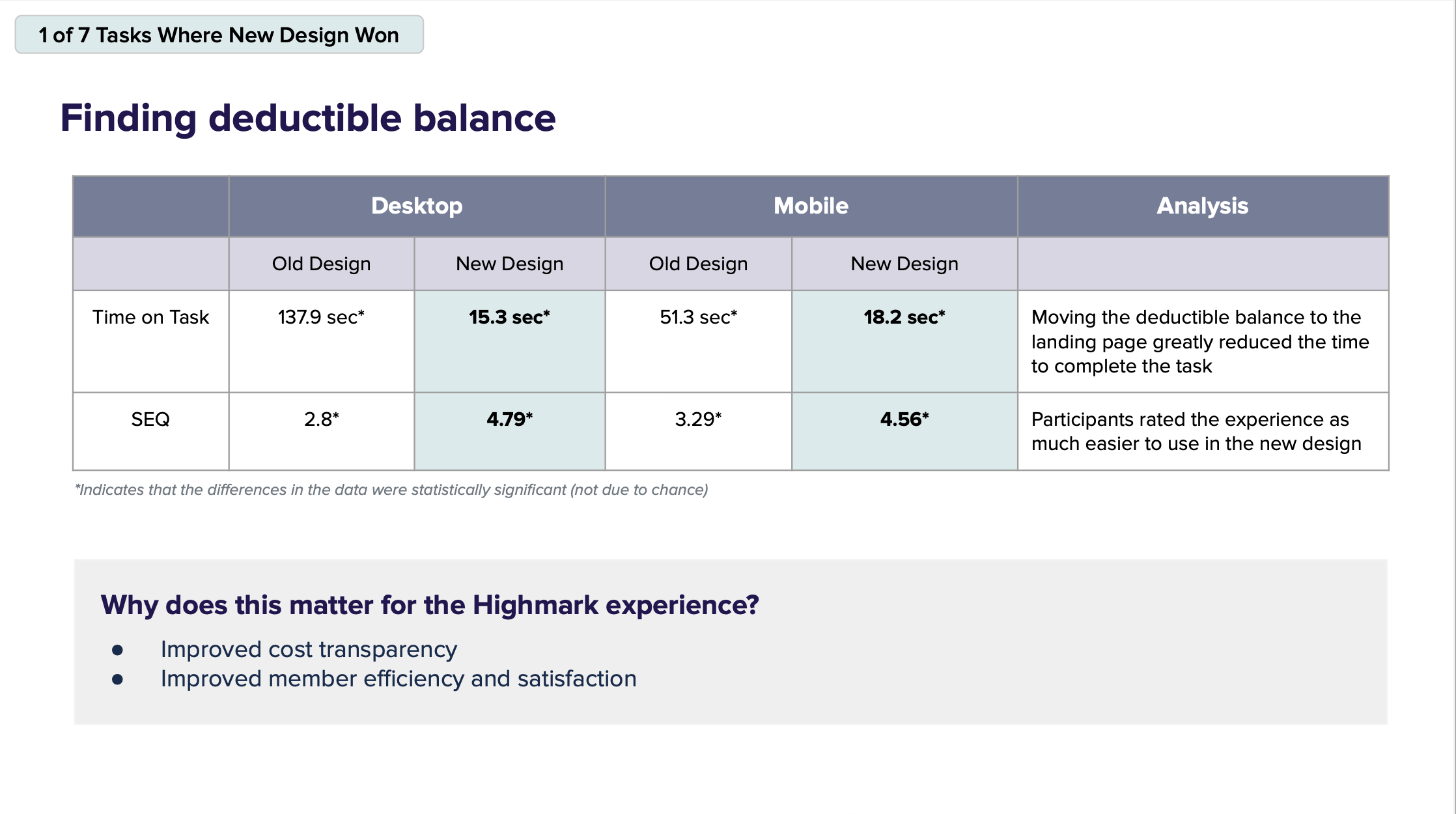
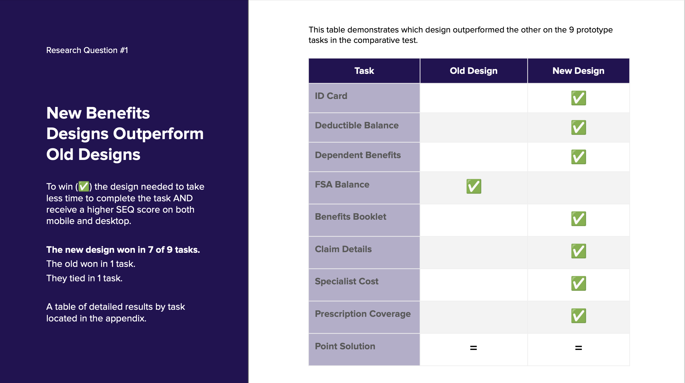
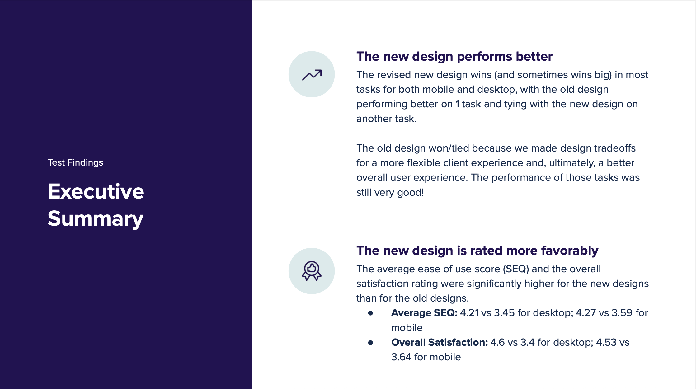
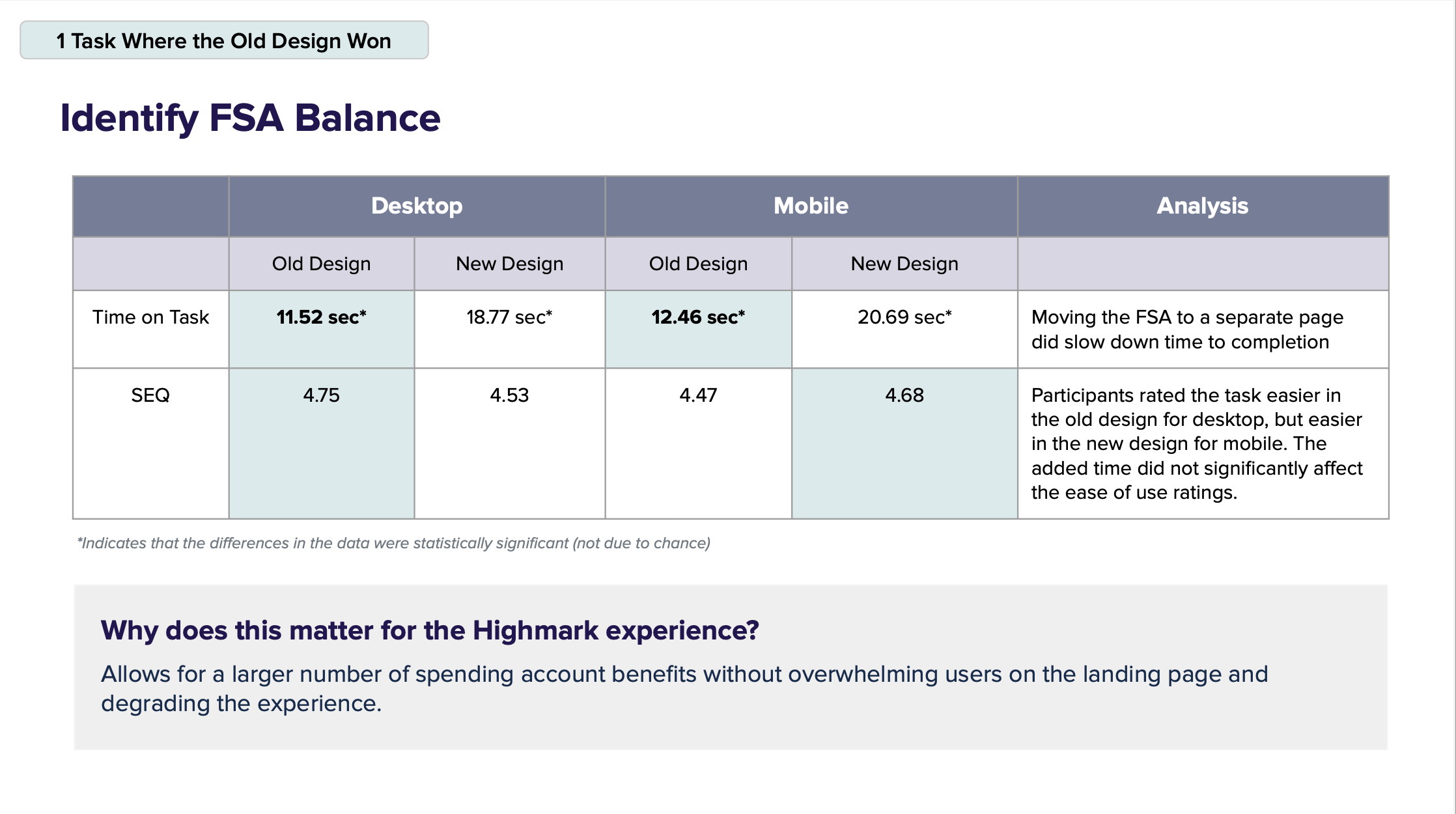
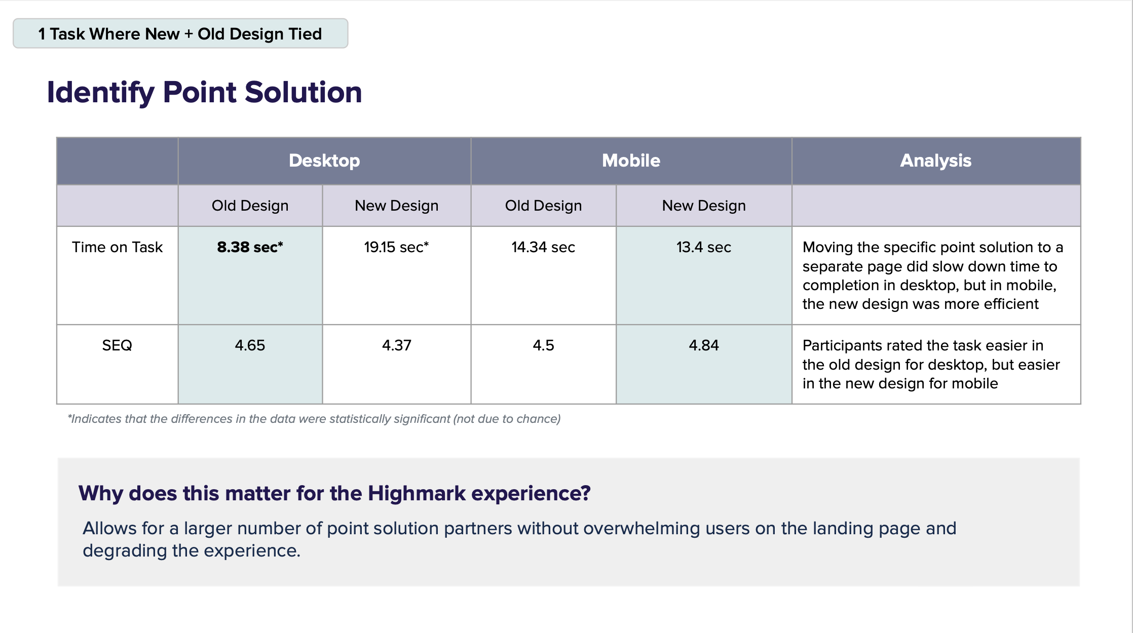
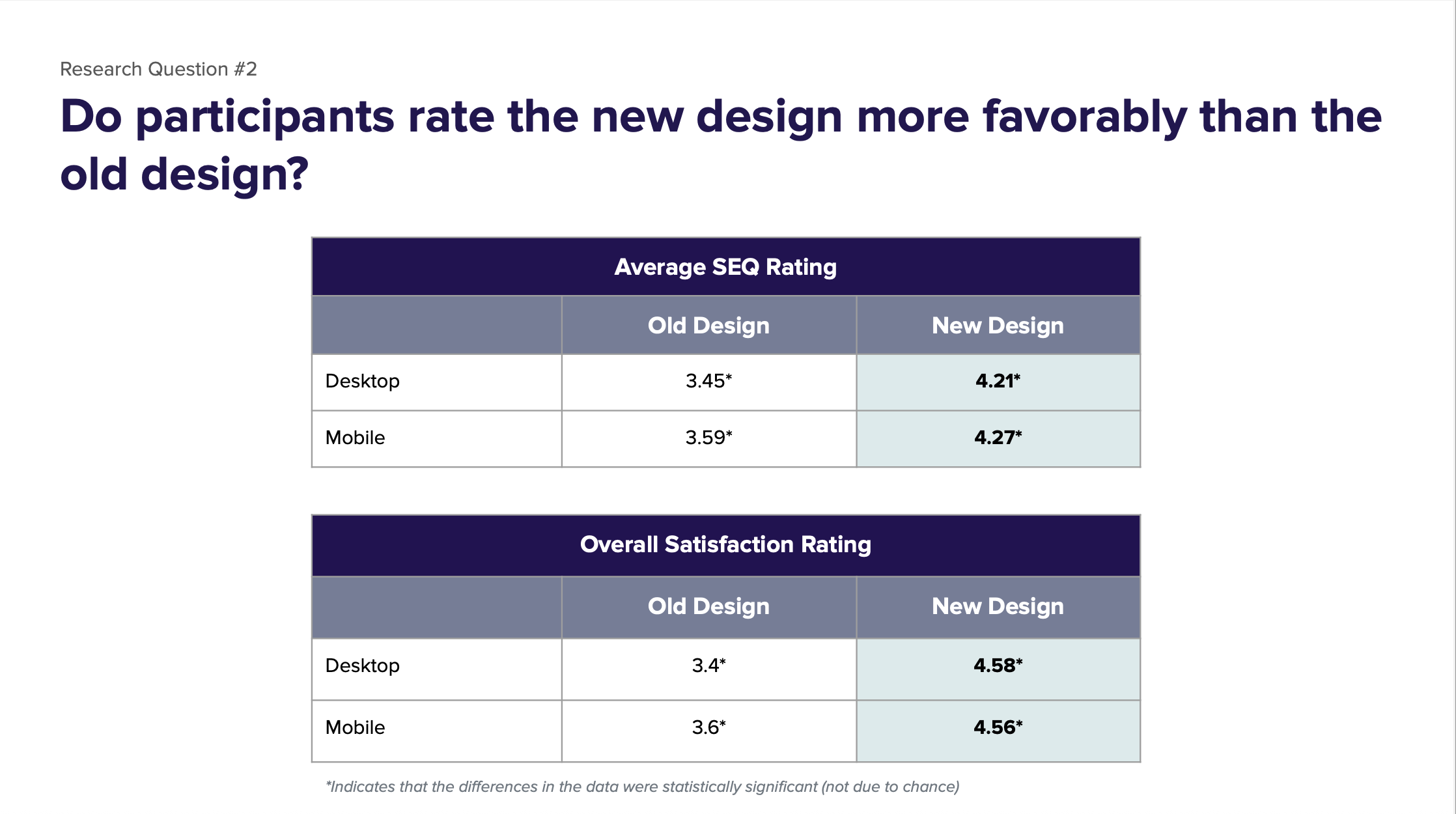
In a high-fidelity comparative test with 168 participants:
7 out of 9 tasks were completed faster and more easily in the new design
Example: Finding deductible balance went from 138 sec → 15 sec (desktop), and from 51 sec → 18 sec (mobile)
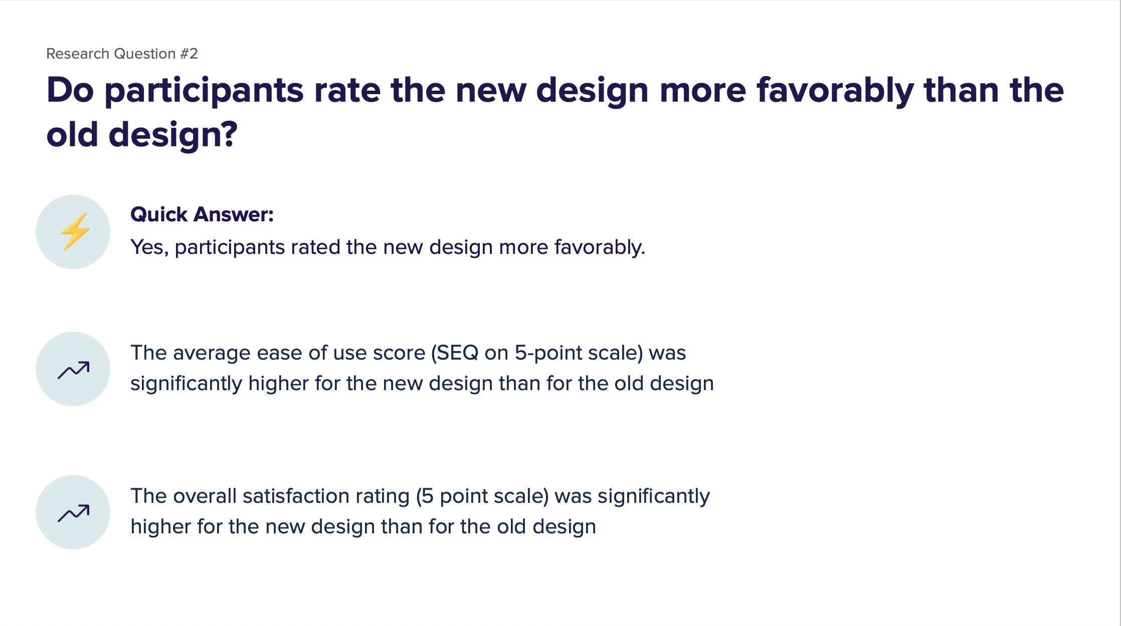
SEQ (ease-of-use score) increased from 3.45 → 4.21 (desktop) and 3.59 → 4.27 (mobile)
Overall satisfaction improved from 3.4 → 4.6 (desktop) and 3.6 → 4.56 (mobile)
Created scalable architecture to support additional partners and point solutions
Reduced time-on-task for essential workflows, improving member self-service
Informed future roadmap items: coverage linking from claims, appeals initiation, cost estimation tools